

Think about a website you’ve visited that does not include a form of any kind. I’m talking no registration form, survey, billing or shipping form, customer feedback form, or even simple email sign up form.
Companies implement forms on their websites to provide visitors with a way to sign up for an account, purchase a product, pay for an item, and more. That’s why online form design matters so much — without a simple, user-friendly, aesthetically pleasing form, how are you supposed to entice your visitors to take the time to provide you with all of that personal information?
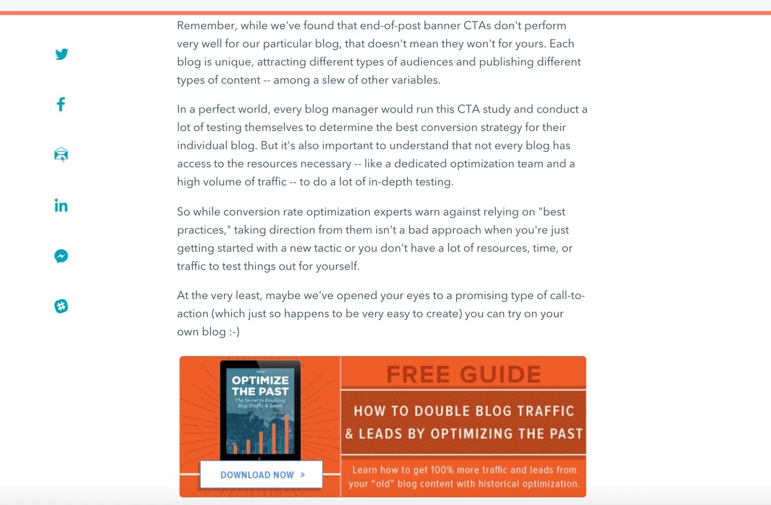
Well, you really can’t — not without great form design.![Download Now: The Ultimate Guide to Web Forms [Free Ebook]](https://no-cache.hubspot.com/cta/default/53/d8b6ce89-2583-4f2a-8dd0-6a9c64f582b5.png)
Why Does Form Design Matter?
Simply put, great web form design helps you increase conversions.
The design of your form impacts your website’s overall user experience (UX), which in turn directly impacts your number of happy visitors and conversions. A well-designed form shows users that your brand is helpful, thoughtful, professional, tech-savvy, and enjoyable to work with.
A poorly-designed form, on the other hand, may lead to page and website abandonment or a frustrated user and, therefore, a decrease in conversions and sales. For example, Expedia learned they were losing $12 million a year in profits because of one extraneous form field box alone!
Web forms are critical for converting users into customers, so you want to make yours easy-to-use, professional, and sleek. In this guide, we’ll review 15 practices you can use to design a great form, including the importance of web form user interface (UI) design, mobile form design, and call to action (CTA) design.
Form Design Best Practices: 15 Tips to Boost Conversions and UX
We’ve curated the following list of 15 tips and tricks for designing a form with a great user experience. Depending on your form type and length, you can pick and choose which tips are best suited to your needs.
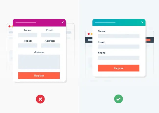
1. Be simple and straightforward
If a form asks for too much information, you risk losing submissions and conversions. In fact, Imagescape was able to increase conversion rates by 120% by simply reducing their number of form fields from 11 to four. When creating your form, include only the most crucial information you need and refrain from adding any unnecessary fields and questions.
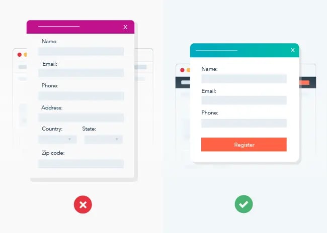
2. Use one column
Stick to a single-column web form layout — an especially important tip when creating long, multi-step forms. Single-column layouts are easier to follow, understand, complete, and submit for your visitors.
A study by CXL Institute found participants were able to complete a single-column form an average of 15.4 seconds faster than a multi-column form. Your visitors don’t want to waste their time trying to understand and complete your form. In fact, you might just lose their business if your form is too difficult to work through.
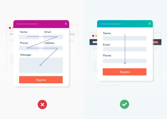
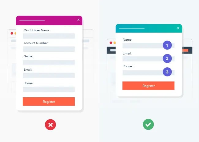
3. Arrange your form fields from easiest to hardest
Start your form with the easiest field questions (like name and email) before asking your visitors the more time-consuming questions (such as billing and shipping information). Once your visitors begin filling out your form and think, “Okay, I can quickly add my name and email”, they become less likely to leave the page since they’ve already committed.
If the first form field is a hassle for them (“Shoot, I don’t have my credit card nearby ...”) they may be more likely to abandon the form since they haven't already invested time in it.
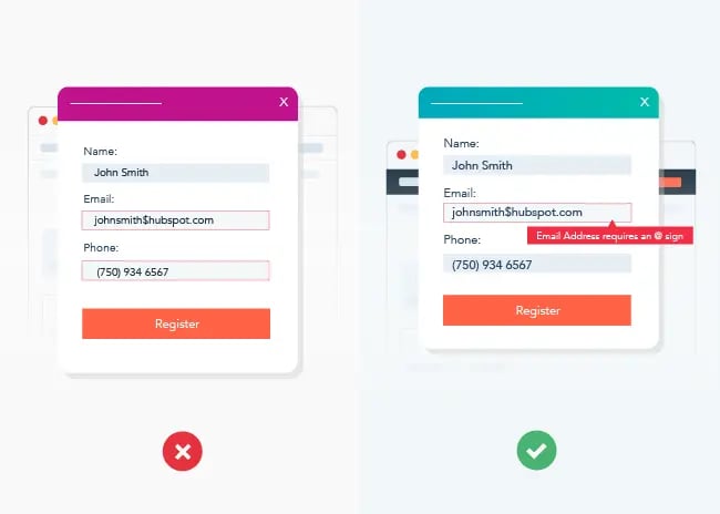
4. Use inline form field validation
Inline form validation is a process in which a visitor’s information is reviewed in real-time as they work their way through the form. If your visitors fill in a field with incorrect information, such as an invalid email address or credit card number, an error message will appear below or inside the form field notifying the visitor of their error so they can quickly correct it and move on to the next question.
5. Align text to the left
Align all of your text (questions and labels) to the left side of the form so it’s natural to read and complete for your visitors. University of Basel researchers found aligning your text on the left side, above the form field box, lowers the amount of time needed to complete the form. This natural alignment decreases the amount a user’s eyes need to jump across the page and makes the form more readable.
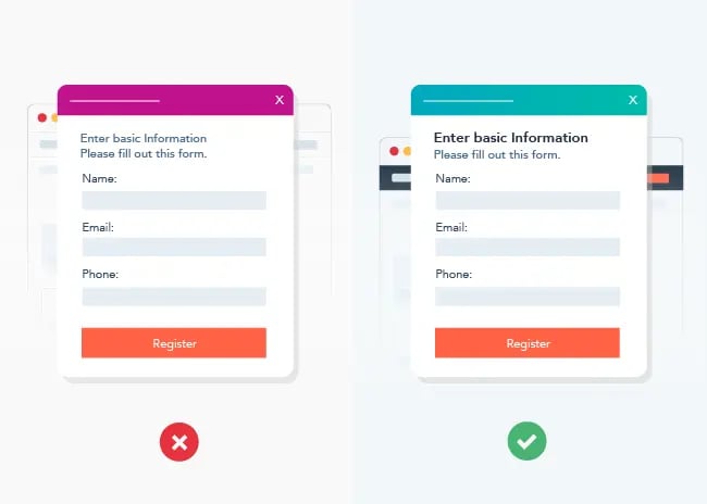
6. Clearly title your form
Give your form a title that helps your visitors understand exactly what they’ll receive once they submit it. For example, a simple form title such as “HubSpot’s Marketing Blog Sign Up Form” clearly states that the visitor will have signed up for HubSpot’s Marketing Blog once they submit their information.
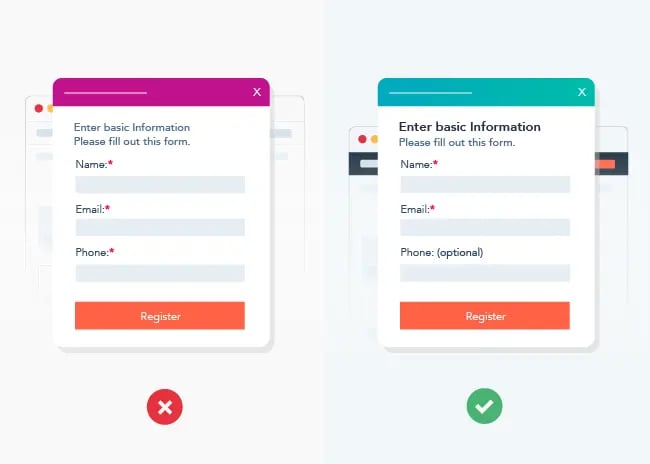
7. Don’t ask for phone numbers
Unless obtaining your visitors’ phone numbers is critical for your business (say a quote request or product demo), don’t require it in your form. ClickTale ran a test and found they lost 39% of user sign-ups when they required a phone number. Asking for your visitors’ phone numbers can feel sketchy unless they know there’s a legitimate reason they’re being asked to provide that information.
When possible, ask for an email instead and contact your visitors that way (with permission). Or make the phone number field in your form optional for your visitors to complete.
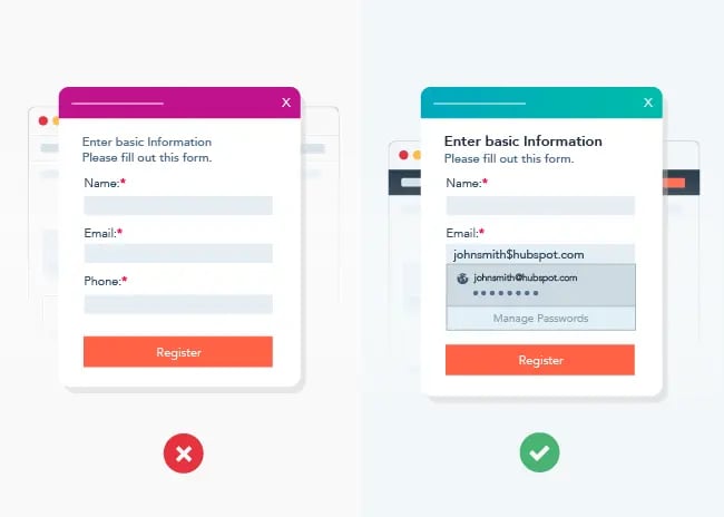
8. Use auto-fill browsers
Completing specific form fields is faster than ever now that browsers like Google Chrome and Firefox have autofill features that pull from past information entered on a visitor’s device (like their first and last name). It’s best practice to title each field with a term, or common attribute, that browsers will recognize to help speed up the form completion process for your visitor.
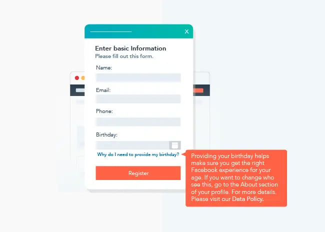
9. Address possible user concerns with summary boxes
It’s typically easy to guess which concerns are most likely to deter potential customers from filling out your form. For example, asking a visitor to provide their zip code if they’re not actually ordering anything might be unsettling. You can address these concerns with summary boxes explaining your need for certain information or with statements that clarify whether or not the form field is optional.
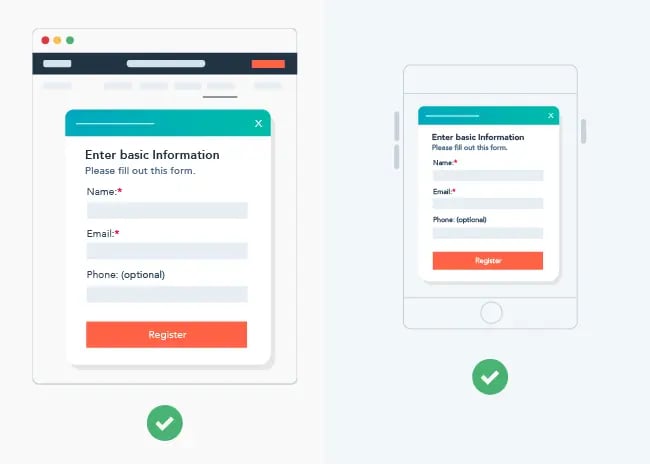
10. Design mobile forms differently
Today, it’s no secret people are browsing your site, buying your products, and completing your forms via their mobile devices — that’s why it’s crucial to implement mobile-friendly form design. This way, your visitors can easily view your site on any mobile device, all of the form information fits the screen it’s being viewed on, and the form can be completed and submitted easily while on-the-go.
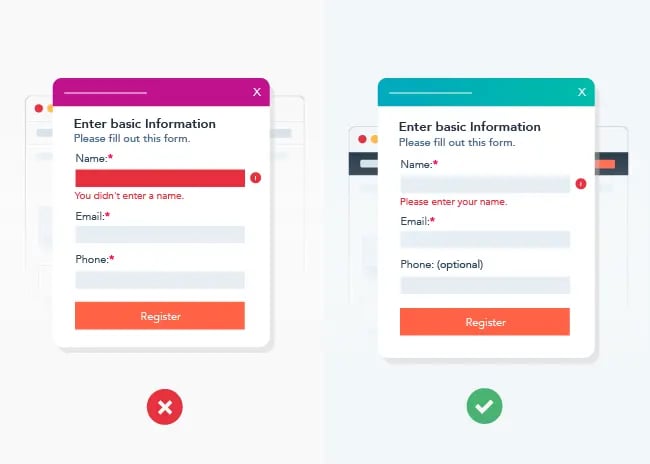
11. Use positive error messages
When creating web form error messages, which act as an effective way to ensure only accurate information is submitted, be sure to sound positive. You should never blame the user — instead use language that’s clear and concise, and include information that directs the visitor to the error so they know exactly where it’s located and how it should be corrected.
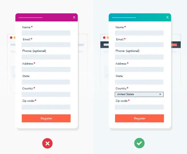
12. Include smart defaults
Enabling smart defaults is another great way to speed up the form completion process and ensure accuracy. Smart defaults use information like your user’s current location to automatically enter details like city or town so that site visitors don’t have to.
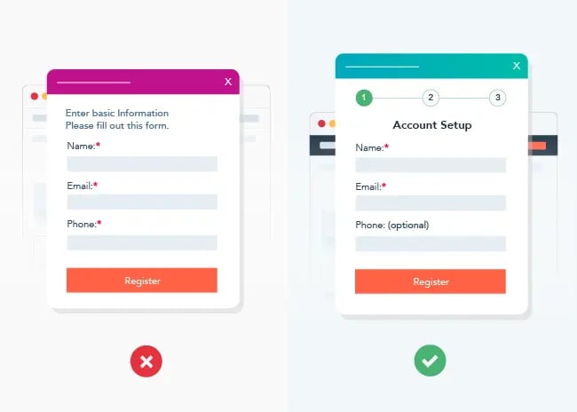
13. Add progress bars for long forms
Have you ever been completing a long form or survey and wondered, “How many more questions are there?”
Progress bars display the number of questions your visitors will need to answer on your form. They give your visitors an idea of how much more time they’ll need to complete it. These are especially helpful on long, multi-step forms.
14. Use reCAPTCHAs, not CAPTCHAs
Upon completing a form, have you ever been asked to look at a fairly hard-to-read image with a series of numbers and letters in it and then type those numbers and letters into a form field to prove you’re “not a robot”?
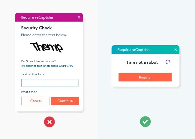 If so, you’ve completed a CAPTCHA. CAPTCHAs exist to detect SPAM and bots. However, they can be time-consuming and frustrating to complete. There’s still use for them though, and you may want this added security measure included in your forms. If this is the case, you should implement reCAPTCHAs in your forms instead.

reCAPTCHAs are not only more effective in detecting fake accounts and bots but they also simply require your visitor to check a box before form submission.
15. Enable the ability to tab to next form field
With the number of keyboard shortcuts available these days, there’s no reason why your form shouldn’t enable them. Allow visitors to use the tab key on your forms so they can move to the next form field without lifting their hands off of their keyboards.
Grab our guide to learn how to optimize and split test your landing pages.
Web Form UI
Web form UI, also know as user interface, is the part of an information device (such as a smartphone) that a person (or user) directly interacts with (such as the screen or keyboard).
Improving your UI is a way to enhance your users’ experience of your form. There are three main parts to a form’s user interface you should focus on when creating your forms: structure, layout, and patterns.
Structure
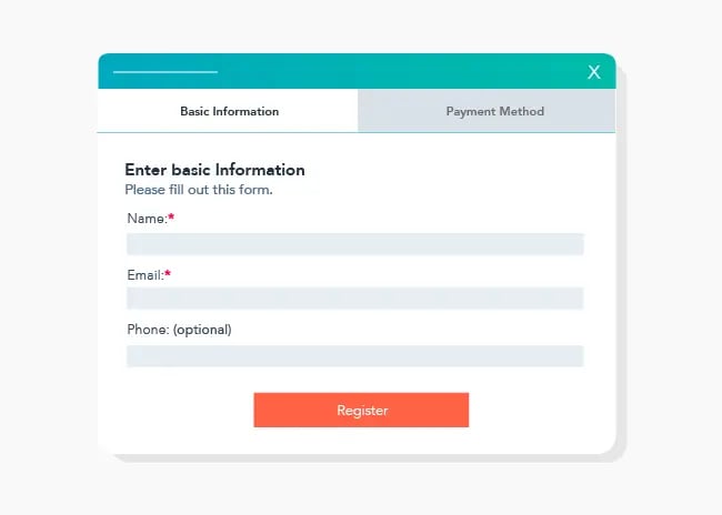
Consider your form structure in a strategic way — what’s the best way to structure your form to improve user experience? Think about the order in which your fields appear, the form’s appearance on your web page, and how your fields and sections flow from one to another.
For example, take a look at Airbnb’s multi-step form for booking a place to stay.

Because the form includes multiple steps and many form fields, the form is split up into different steps and pages to make the process less daunting for visitors. A visitor enters details about their stay (where and when) on the first page, then they’re prompted to make a selection of where they want to stay on the second page before they enter payment information on the final page. The form fields are grouped together appropriately and organized in a way that makes sense.
Layout
The layout of your form fields also matter when it comes to UI. Ensure the layout and order of your questions feel natural. For example, instead of putting email and payment fields next to each other, separate them so they’re placed in sections that make sense based on the type of information a visitor’s providing.
You can also get creative with your form layout. For example, instead of a normal, single-column form in which your visitors must simply add their information and click submit, you can implement a Mad Libs-style layout so visitors can fill in the blank and create more of a story with their responses.

Completing a web form is not always an exciting task, so it helps to make form completion a fun, interactive experience.
Patterns
UI patterns are repetitive solutions to common, recurring design-related problems your visitors face while completing your forms. These solutions work over and over again to improve your form’s UI and ease of use. There are dozens of UI design patterns that you can use in your own forms based on your needs.
For example, have you ever been signing up for a new account, and when you entered a password, an error message came up saying your password entry was not accepted because it “wasn’t strong enough”?
To make password creation easier for your visitors, add a password strength meter that tells them in real-time the strength of their password so they know how much more creative it should be to improve their security.
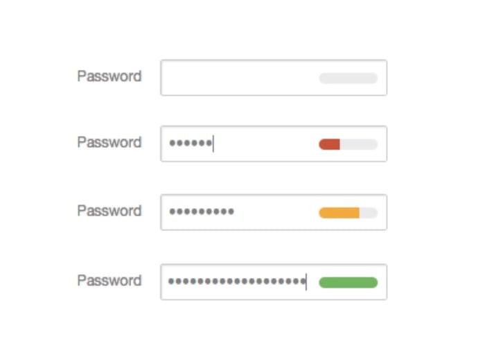
This UI pattern improves UX by making it simple for visitors to create a valid password as well as understand how secure their password is.
Mobile Form Design
Mobile form design is crucial to the success of both your forms and your site as a whole. In this section, we’ll cover some design basics as well as tips that you can implement in your own forms to enhance their UX.
What is mobile form design and why does it matter?
Mobile form design is the process of creating web forms that are user-friendly and responsive to mobile devices, such as a smartphone or tablet. This means that the written and visual content on a form must fit every device’s screen.
It’s safe to say most of us carry a mobile device of some kind with us every day. People are visiting your site while they’re commuting to work, traveling, or simply sitting on their couch,. Be sure to simplify their future sign-up, registration, or purchase processes by implementing mobile-friendly form design.
By ensuring a successful design, you’ll enhance your user experience and therefore likely increase your conversions. And who doesn’t want a greater number of customers and more business?
Five mobile design UX tips
When building your mobile-friendly web forms, consider the following design tips to help you create the best possible user experience.
1. Implement a single-column layout
Think about the size of the screen on an average smartphone. Although companies like Apple continue to build larger and more impressive displays, mobile screens are still significantly smaller than those of desktop computers. So creating a form with several columns would most likely be hard to read and work through for your visitors. You should stick to single a column layout so your visitors can review and complete one field at a time and simply scroll down the page as they work through the form.
2. Enable autocorrect and autocomplete
Not only is a mobile device’s screen smaller than that of a desktop, but the keyboard is too. Unless you have small fingers or you’re an excellent texter, typing detailed information, such as shipping or payment details, into a mobile form may be a tedious and time-consuming task for your visitors.
That’s why you should make sure your form has autocorrect (meaning the form automatically corrects known errors like spelling) and autocomplete (meaning the form will automatically complete specific fields such as filling in your visitor’s zip code based on their location). This expedites the form completion process, ensures only accurate information is submitted, and saves your visitors from having to type in every piece of information.
4. Make your form beautiful
Appearance matters — that includes your mobile web forms. Some screens can be tiny so keep your form design minimalist, color-coordinated, and aesthetically pleasing. You should also brand your form in a simplistic way — even though the form is on a small screen, branding it will make it look professional as well as remind your visitors who they’re doing business with.
5. Keep it minimalist
Typically, you can apply the saying “less is more” to all aspects of your website. Nobody wants to read through a bunch of fluff or look around a cluttered site for the information they need. This is especially true on a compact, mobile-device display. Keep your number of form fields to the bare minimum, use straightforward language, and keep all other elements of your design simple.
CTA Form Design
Almost all web forms include a call-to-action (CTA) of some kind. The more clicks on your CTA button — which might read something like “Learn More”, “Get More Conversions Now”, or “Download Now” — the greater your potential for acquiring a new lead or customer. The design of your CTA is critical … otherwise, why would someone want to “learn more” or “download” your product, let alone even notice a CTA on your page?
Before we dive into the different CTA form design factors you’ll want to consider when creating your own CTA, let’s quickly review what a CTA actually is.
What is a CTA?
HubSpot describes a CTA, or call-to-action, as “...a button or link placed on a website to drive prospective customers to convert to leads via a landing page form.”
A CTA should be placed in an easy-to-spot location on your web form. In addition to a web form, a CTA might be placed on a web page, a blog post, or in an email. Your CTA should look nice, grab your visitor’s attention, and employ a minimalist design so your visitor can quickly understand what your offer includes.
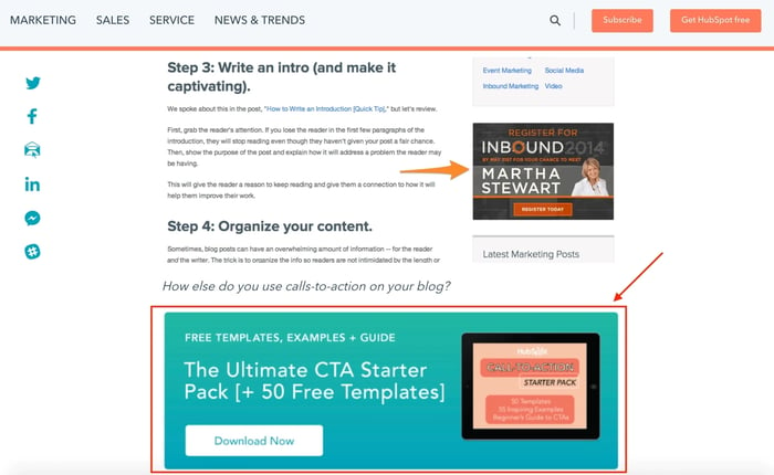
Make things easier and grab these 25+ free CTA design templates.
Five CTA Design Factors to Consider
Now, let’s review five different aspects of CTA design: size, action button, font, special effects, and placement.
1. CTA size
If your CTA is too small, you risk having someone miss it completely. If your CTA is too large, you risk coming off as spammy, unprofessional, and pushy.
When determining the size of your CTA, look at the entire web page. You don’t want it to feel cluttered, but you also want to ensure your visitors organically notice your CTA while browsing the page or form.
2. Action button
Every CTA has an action button (hence the name call-to-action). That action button is the thing that your visitors actually click to “Download Now” or “Learn More” — so, the way it looks and what it says matters quite a bit.
Your action button should stand out. You don’t want anyone to wonder whether or not they’re clicking the correct button. You should also use concise, direct, action-oriented, and impactful language so your visitors know without question what they are getting out of your CTA.

3. Font
Have you ever been looking at website content and realized how much you had to strain your eyes to actually read the content? Whether it’s size, typography, or color, your font plays a big role in a visitor’s experience.
And with something as important as a CTA, which impacts your conversions and sales directly, you don’t have any room for mistakes, such as choosing the a font that’s too small or difficult to read. Implement an easy-to-read font that works with the color, style, and size of your CTA.
4. Special effects
When I say “special effects”, I’m not referring to the special effects in movies or videos. I’m talking about special effects that you can easily add to your CTA to create a more eye-catching design. For example, beveled edges, drop shadows, rounded corners, arrows, and gradients are all simple ways to create a CTA that visitors will click.

5. Placement
The placement of your CTA is important because you want visitors to see it organically while working through your form. The point of including a CTA on your web page or form is to get your visitors to naturally stumble upon it while they’re on your site or completing your form fields — nobody should ever have to search around for a CTA. That would defeat its purpose.
To learn about some great CTA examples, check out this blog post.
Conclusion
No matter what type of business you run or work for, chances are you have at least one type of web form on your site. By applying these form design tips that enhance UX, as well as UI design, mobile form design, and CTA design, you’ll provide your visitors with a reliable and positive experience that helps you boost conversions. So, think about the forms that you need to include on your site and begin implementing design tips and takeaways that apply best to your business’ needs and goals.


![Email Capture: 7 Surefire Ways to Acquire Email Leads in 2022 [+Tools]](https://blog.hubspot.com/hubfs/email-capture.png)