It’s Time To Rethink Dashboard Design
Ready to help your teams act on data-driven insights? Redesign where analytics show up in their workflow.

Edouard Picot
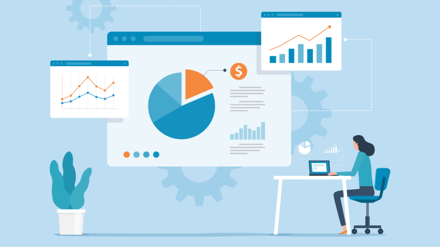
There’s no doubt your business collects more data than ever – especially in the generative AI era. Pinpointing relevant insights for your end user, however, is a significant challenge many organizations face. There is a way to improve the user experience and make business insights more accessible: Transform static dashboard designs into intelligent app designs.
As an executive leader who leads design for analytics at Salesforce, I’ve learned the importance of educating our customers about design. We have powerful tools and templates to get users started, but it’s essential to apply design strategy when implementing those resources.
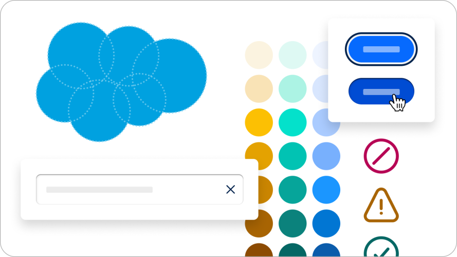
For example, embedding business analytics into users’ day-to-day work makes it easier for them to create and act on data-driven insights. Layering relevant information in “bite-sized” pieces is also helpful. By applying design best practices, we can humanize how we collect, prioritize, and display data.
A new approach to dashboard design
Traditional dashboards usually are individual static documents that someone creates and pushes out for someone else to consume. A typical dashboard design looks something like this, where there’s a display of information across dense grids of charts:
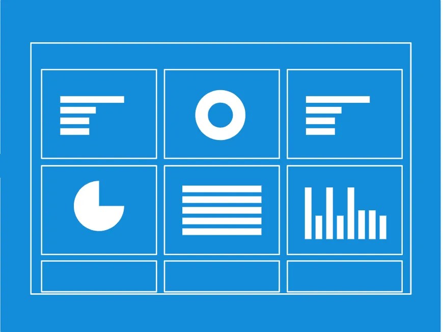
This type of dashboard design is often too complicated for users to interpret and act on. It places the onus on the user to discover relevant insights, which isn’t approachable. It’s time to rethink dashboard design as we know it – with an app.
Design an app for that
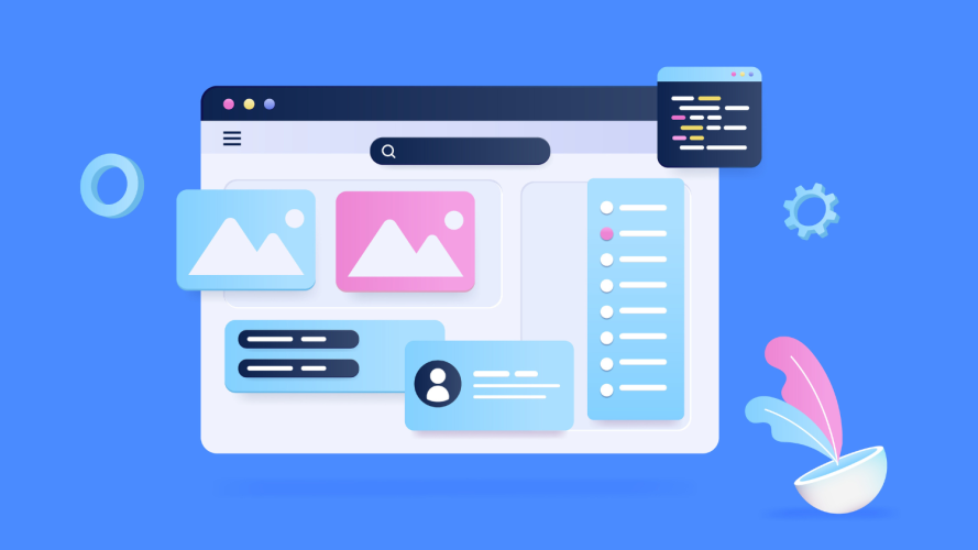
The alternative to traditional dashboard design is to use an intelligent analytics apps model that centers the user experience. The best business analytics apps are seamlessly embedded where your users already do their daily work and push the right insights at the right time.
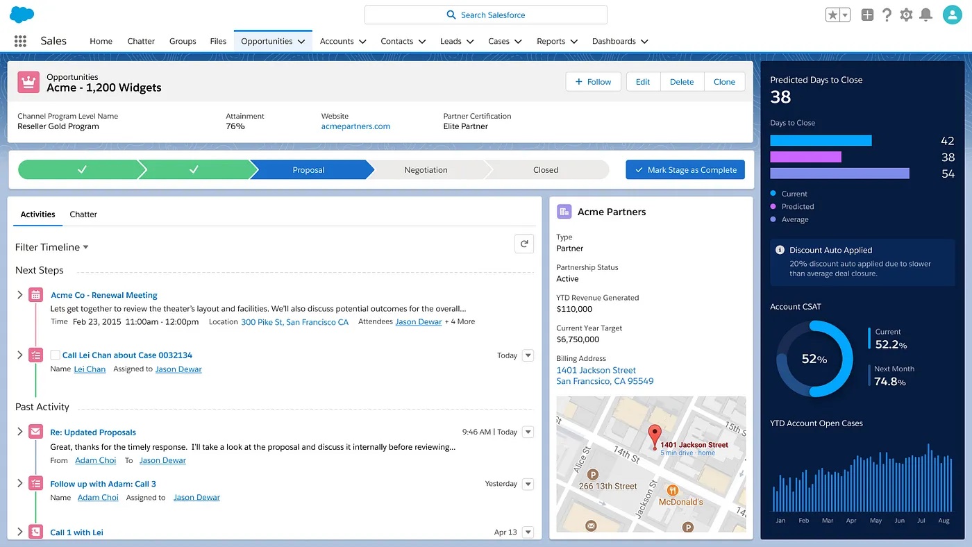
The app model offers access to relevant data in context, enabling users to take action without leaving their workflow. Here’s an example of how that might look in the Salesforce context:
The benefits of an app include:
- Apps have dynamic layers that provide information in smaller, focused bites.
- Users can drill in where they need details, and zoom out for the big picture when required.
- Apps are device-specific, making them portable and available to users anywhere — desktop, laptop, or mobile.
Before developing a business analytics app, you need to understand the goals of users clearly and the purpose the data is meant to serve. You have to know what questions the data needs to answer in order to guide users toward the right answers and actions. User research can help.
Understand your user’s goals
To design a user-focused experience and better empathize with your users, bring them into the design process. Through qualitative research, get to know them. Talk to them. Seek to understand their challenges and objectives. From there, you can craft personas that form a shared understanding across your team and a strong base for the rest of the design process.
When you understand what your users are working toward, you can also spot the obstacles they face in getting there. One of the biggest pitfalls to navigate is a lack of trust in the data itself.
Often, the problem is that there’s no single source of truth. When data isn’t integrated and synchronized, it’s difficult for users to be confident in the information they find.
Designing a business analytics experience that offers users relevant insight in context — and allows them to take action in real-time — will lead to higher adoption and trust in data. Once you understand your users’ goals for the app design, the next step is to figure out what questions they’ll ask the data to answer.


Shift from brainstorming to question-storming
The challenge is to get into your user’s mind and to make sure you’re delivering relevant and helpful information. What do they need to learn from the data? What do they want to do with the insights?
One productive approach is something we call “question-storming.” It’s the process of identifying the questions users need the data to answer so they know what actions to take.
If you know the questions, then you can begin envisioning how the answers should appear. Switching from brainstorming metrics to brainstorming questions allows you to understand potential solutions through users’ perspectives.
How does question-storming work?
- Choose a persona: Choose a target persona or identify an individual within a particular user group.
- Ask questions: Then collaboratively go through a series of questions around the data. You can do this activity informally with sticky notes or on a whiteboard.
- Affinity map: After the questions are written and agreed upon, group similar ones under themes and rank them under those themes.
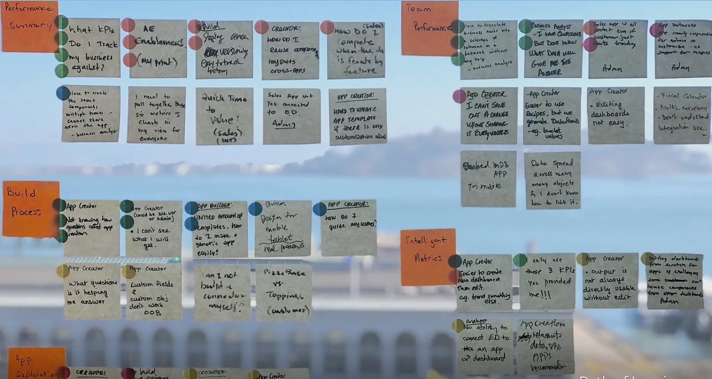
Here’s an example of what question-storming with sticky notes looks like. This view allows you to envision what actions the user will take with the right data.
Embrace user research
User testing is important. Get their input both on the prioritization of questions as well as the proposed visualizations and actions. This will help prevent costly mistakes early in the design process.
If your designs start to feel complex or try to answer too many questions at once, refer back to your question prioritization. Turn to techniques such as progressive disclosure, where information is revealed only when it is relevant. A great example of this are dynamic page layouts. It hides or reveals more data with just a click.
The result of this process is that you have all the building blocks to develop a business analytics apps experience. You can now dynamically embed discrete and targeted visualizations in the context of appropriate workflows.
Design around your user’s questions
Why shift from providing static dashboard designs to actionable apps prioritized around your user’s top questions?
- You relieve the need to swap between systems.
- You offer more guidance in context and enable them to do their jobs better and faster.
- The insights are contextual, timely, and relevant because you designed them that way.
- When users are empowered to make informed decisions about what to do, when, and why, they deliver more value to their organizations.
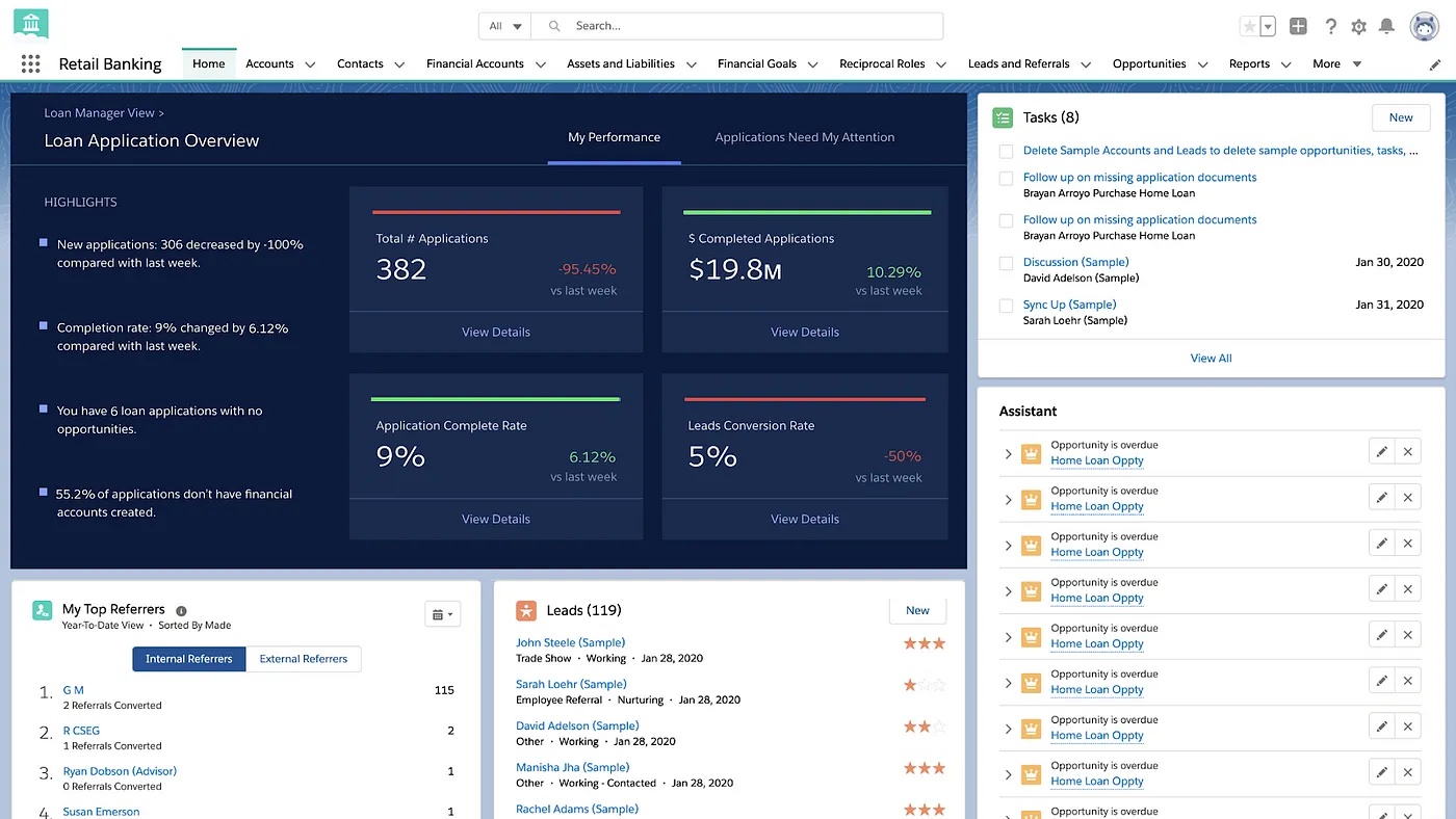
This example of an app dashboard design shows performance rate:
The role of analytics in business has grown and will continue to evolve. It’s becoming more fluid and more embedded in workflows. All of this will help people and organizations make better data-driven decisions. These experiences invite data to become active members of every team, conversation, and action.