10 internal linking best practices for accessibility
Learn how Internal linking, a powerful tool for SEO, is pivotal in creating a navigable, user-friendly website for people with disabilities.
Internal linking has often been a powerful tool for SEO, helping serve as a bridge to connect various webpages. One main goal has typically been to boost visibility in search engines.
However, the importance of internal linking extends beyond SEO; it’s pivotal in creating a navigable, user-friendly website, especially for people with disabilities.
Internal linking is one area that SEO has influence in terms of where and how it appears on a website.
Unfortunately, many SEO linking recommendations have contributed to the inaccessibility of websites.
Fortunately, SEOs are in a great position to support change and provide better online experiences for site visitors – and sure, Google.
That being said, SEO support alone is not enough. To truly elevate accessibility, it’s imperative to integrate individuals with disabilities across the entire workforce spectrum, from executive roles to entry-level positions and everything in between. Such inclusivity enriches the workplace environment and significantly enhances overall accessibility standards.
If you’re ready to begin the process leading with accessibility regarding internal linking, here are a few recommendations to help get you started.
Table of contents:
1. Use clear and descriptive anchor text
2. Match anchor text to user intent
3. Avoid overloading with links
4. Indicate links that open in a new window
5. Use easily identifiable link styles
7. Use a global static navigation
8. Avoid hyperlinking headings
10. Limit the use of redirects
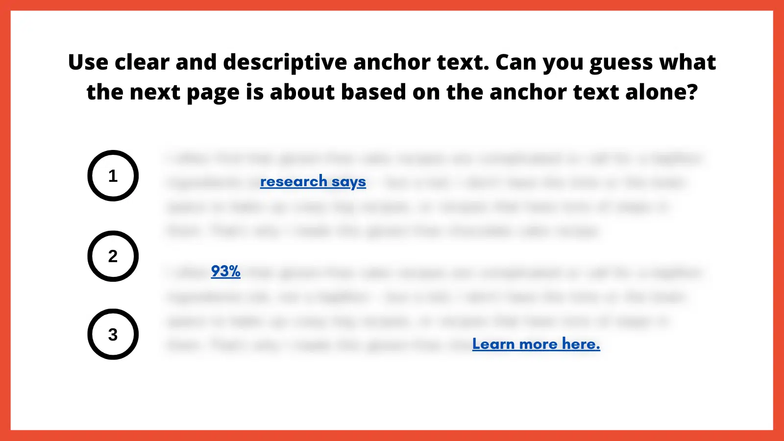
1. Use clear and descriptive anchor text
Using clear and descriptive anchor text (a.k.a., link text) is fundamental for website accessibility. Anchor text serves as a guide, directing users to what they can expect when they activate a link. Without clear descriptors, users may experience potential navigation errors, especially those relying on screen readers.
“Vague anchor text such as ‘click here’ or ‘read more’ doesn’t provide any context. This is especially problematic for screen reader users who may not have immediate access to the surrounding content that might provide additional hints about the link’s destination. Non-descriptive anchor text can turn browsing into a series of unexpected outcomes and a poor user experience.” according to Stephanae McCoy, founder of Bold Blind Beauty.
Here is an exercise I like to use to illustrate the importance of clear and descriptive anchor text. You essentially blur all surrounding text so only the anchor text is readable. From here, ask yourself: Does the anchor text make it abundantly obvious as to what the next page is about?
How to implement
Choose descriptive phrases that provide a clear snapshot of the linked content. This enhances usability and boosts user trust, as they know what to expect from each link.
Alternatively, leveraging ARIA-label attributes can also provide more context by replacing the anchor text with a more meaningful value to provide the necessary context for screen reader users. Replacing anchor text with something valuable helps ensure that each occurrence is distinct and meaningful.
2. Match anchor text to user intent
Matching anchor text to user intent is important for a straightforward browsing experience. Users who click on a link have an expectation based on the anchor text’s description. If the resulting content doesn’t align with that expectation, it can lead to a poor user experience. This inconsistency can be jarring for users with learning disabilities, leading to mistrust.
“Anchor text is possibly the most important part of internal linking, so you need to do it properly. What does ‘click here’ tell the reader? The search engines? People who use screen readers? Nothing. It tells them absolutely nothing. Everyone, and every bot, who is scanning your website needs to understand where they are going,” according to Alice Rowan, website copywriter and SEO consultant, and a community member of Neurodivergents in SEO.
This can also be irritating for screen reader users. Imagine selecting a link labeled “gluten free chocolate cake recipe” and instead being taken to a landing page to purchase chocolate. Your anchor text should serve as a promise and the linked page should deliver on that promise.
How to implement
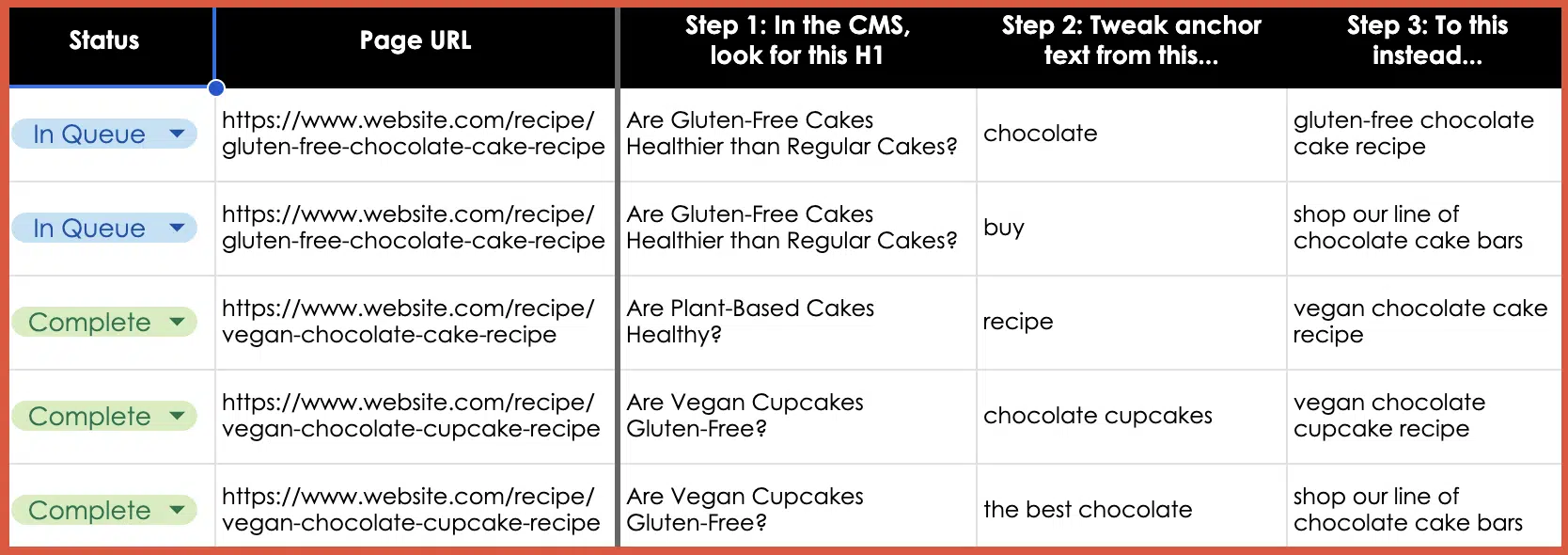
Regularly audit internal links to make sure they lead to relevant, expected content. Ensure links consistently deliver on their promises, fostering trust and enhancing the overall user experience. I’ve included a template example at the end of this article.
3. Avoid overloading with links
We might inadvertently create clutter in our quest to provide as much information as possible. A page saturated with links can be visually chaotic and cognitively overwhelming. For users with attention-related disabilities, distinguishing between a multitude of links can be particularly challenging, leading to fatigue and frustration.
For neurodivergent users and those with cognitive disabilities, a cluttered page with too many links can be disorienting, making it difficult to process information efficiently and leading to a strenuous online experience. Simplifying the layout and reducing the number of links can significantly improve navigability and content absorption, enhancing the overall user experience.
For screen reader users, an overload of links can be disruptive as assistive technology vocalizes each link. Screen readers use quick navigation keys to efficiently navigate web pages, allowing users to jump to specific elements like headings and links. Navigating through a lengthy list of links can become tedious and overwhelming, making it challenging to retain information or decide which link to select.
SEO best practices typically suggest fewer than 100 links per page, but a more user-centric approach would be to aim for approximately 25-30 links or fewer. This helps to enhance page clarity and navigability, including for keyboard-only users.
To further optimize the layout, it’s best to avoid crowding links together. In addition to integrating and spacing them in the body text, also consider using bullet lists or tables to improve layout organization.
How to implement
Be judicious with linking. Instead of linking every possible keyword, focus on linking relevant, valuable content that enhances the user’s understanding or provides avenues for deeper exploration.
Ask yourself: Am I only adding this link solely for SEO, or am I adding it because it genuinely adds value? Also adopt this mindset if/when link building.
4. Indicate links that open in a new window
Links that open in a new browser window or tab can introduce unexpected behavior, which can be disorienting. This sudden change is almost the equivalent of having a conversation, then being moved to a different room without warning. For users who rely on screen readers or those who are neurodivergent, these surprises can disrupt the entire browsing experience.
“Screen reader users might not immediately realize that a new window or tab has opened. They might continue attempting to navigate as if they were on the original page, leading to confusion,” according to Raghavendra Satish Peri, founder at DigitalA11Y.
Users with motor disabilities might find switching back and forth between windows or tabs challenging, making the experience cumbersome.
In the SEO industry, it has been previously recommended that we open a new window if it directs visitors to a different website, that way we avoid losing them completely. However, it’s better to keep users in the same window unless there’s a compelling reason to do otherwise, such as a calendar-based date picker. Another route is allowing users to open links in the same window or a new one.
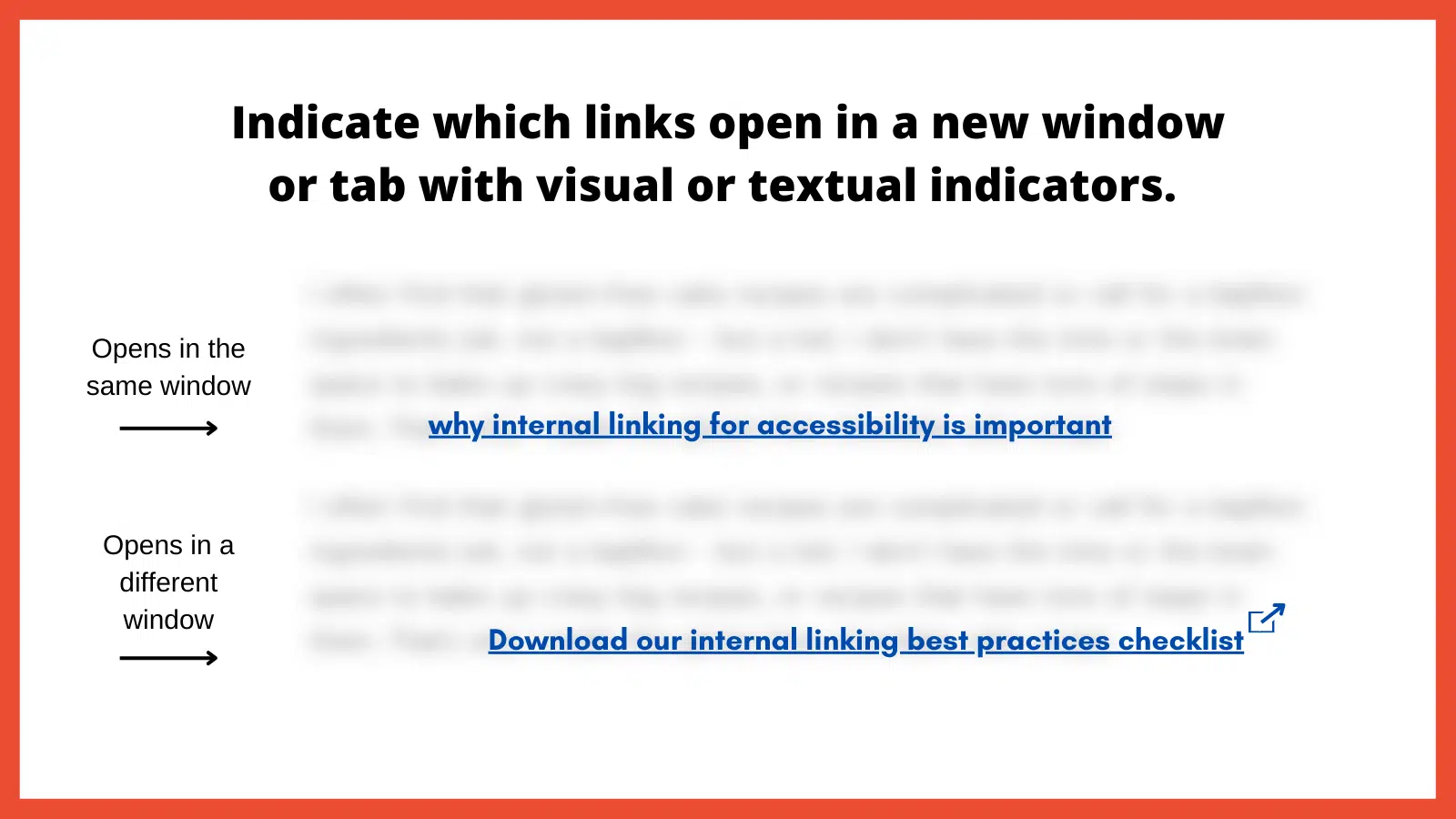
How to implement
Use visual and/or textual indicators to inform users that a link will open in a new window or tab. This can be done by appending phrases like “(opens in a new tab)” to the link text or using distinct icons next to the link. By indicating when links open in a new window or tab, you’re promoting transparency and predictability in the user experience.
5. Use easily identifiable link styles
The visibility and distinctiveness of links are important in encouraging users to identify and interact with them. If links blend into the regular text and are not easily distinguishable, it can hinder navigation, causing users to overlook important pathways. Plus, how can we help increase page views and decrease the bounce rate if links are hard to find?
“For low-vision users or those with color vision deficiencies, indistinguishable links become nearly invisible. Links need to have at least a 3:1 color-contrast ratio to make them stand out,” according to Denis Boudreau, the founder of Inklusiv and Director of Instructor Led Training at Deque Systems.
Similarly, individuals with learning disabilities might struggle with non-standard or inconsistent link styling, as it adds an extra layer of complexity to their browsing experience.
How to implement
Links should have a uniform style throughout the website. The ability to perceive the link will depend on different modalities, such as a specific color, underline or other visual treatment. Maintaining consistency helps users quickly identify links no matter where they are on the site.
Be sure to also utilize a 3:1 color contrast so the chosen color can contrast against the surrounding text, while also meeting a contrast of 4.5:1 against the background. The hyperlinked text should also change in color and/or style when the focus is set to that link.
6. Use breadcrumb navigation
Breadcrumb navigation is a secondary navigation system that displays the user’s location on a website and the path taken to reach that location. Visually represented as a trail of links, usually at the top of a page, breadcrumbs offer users a quick way to understand their current position and how it relates to the broader site structure.
For screen reader users, breadcrumbs provide a quick overview of where the current page sits within the site structure. It offers an alternative navigational method, allowing these users to jump to higher-level sections without navigating back through multiple pages.
Breadcrumbs should be static, not dynamic. This is important for neurodivergent individuals due to its consistency and predictability, which helps maintain website orientation. This fixed format reduces cognitive load by providing a clear, unchanging path, allowing for easier information processing.
“Static breadcrumbs provide a consistent navigation structure, essential for neurodivergent users. This feature reduces cognitive load, allowing users to return to pages higher in the site structure, such as parent categories. This clear, unchanging path helps users dig themselves out of ‘rabbit holes’ and return to the previous page or category,” according to Jack Chambers-Ward, the co-founder of Neurodivergents in SEO and Marketing & Partnerships Manager at Candour,
How to implement
Breadcrumbs should be easy to find, typically at the top of a webpage, and should be visually distinct from other content. Ensure each segment of the breadcrumb trail is linked, except for the current page, allowing users to easily return to previous sections or pages.
Make sure the breadcrumb is marked up semantically, using appropriate HTML elements and ARIA roles so screen readers can interpret it correctly.
7. Use a global static navigation
Global static navigation refers to a consistent set of navigation options that remain unchanged across all pages of a website. Typically found at the top of a website or along the side, this navigation provides a stable and predictable menu, ensuring users always have a familiar set of options to help them move around the site.
Businesses sometimes adjust the top navigation based on user interactions for various reasons. That can include drawing attention to specific products, services or content based on what they believe a user might be interested in. While there can benefits to dynamic navigation, these changes can sometimes complicate the user experience, especially if it disrupts the consistency or predictability of the site.
“Some neurodivergent users, such as people with dyslexia and those with memory-affecting disabilities, particularly benefit from static navigation. If a user is having to regularly relearn or re-adjust to new navigation layouts on every page, it can be disorienting.” according to Billie Geena Hyde, founder of Uptake Agency and community member of Neurodivergents in SEO.
The level of effort to understand and navigate a website should be minimal, and if your site is difficult to navigate, users with disabilities would likely look for alternatives. Many users with disabilities are incredibly loyal to brands that prioritize accessibility.
How to implement
Adopting a consistent global navigation menu across the website provides users with a stable, familiar anchor. This consistency reduces cognitive load and enhances navigational efficiency.
The order of links should be predictable, logical and intuitive. It should include links to the most important or frequently accessed sections of the website, ensuring users can always quickly reach key areas.
8. Avoid hyperlinking headings
Headings play a pivotal role in organizing content and guiding users through a webpage’s structure. They act as signposts or a table of contents that help users understand the hierarchy and flow of information. When headings are hyperlinked, for some users it can disrupt this organizational structure, making the content harder to navigate and understand.
For screen reader users, headings are especially crucial. That’s because users often navigate by jumping from one heading to the next to quickly scan and understand the content’s layout. Hyperlinked headings can throw off this rhythm, as the user might unexpectedly find themselves on a new page or section without intending to navigate away.
It’s important to note, however, that feedback from screen reader users on this issue varies. In conversations with various users while putting this article together, some reported no disruption from hyperlinked headings, while others found them extremely bothersome. This mixed response is the reason for including this point.
How to implement
As a general rule, headings should be free of links. This ensures they serve their primary purpose of structuring content without adding potential perplexity.
If there’s a need to provide a link related to a heading’s topic, it’s better to include that link in the text immediately following the heading. This approach maintains the clarity of the heading while still offering the link.
9. Resolve 404 errors
Broken links are the digital equivalent of dead ends. They disrupt the user journey, leading to frustration.
Commonly known as a “Page Not Found” error, these occur when a user tries to access a webpage that doesn’t exist on the server. These errors can result from a page being deleted, a URL being changed without proper redirection or a mistyped URL.
“From an accessibility standpoint, 404 errors can be particularly disruptive as it breaks the rhythm of navigating through the website. In some cases, it can be challenging to navigate back to a familiar point where it can result in abandoning the website altogether. This can negatively impact the brand, trust and credibility of your website,” according to Nasreen Bhutta, the Chief Communications Officer of Bold Blind Beauty.
How to implement
Use tools and periodic audits to ensure all internal links lead to active, relevant pages. If a user does land on a 404 page, ensure the message is clear and provides guidance on the next steps, including a search bar, link back to the homepage or a list of popular destinations.
Also, provide a way for users to report broken links or issues they encounter. This feedback can help identify and resolve errors sooner rather than later.
10. Limit the use of redirects
Redirects are tools that automatically take users from one URL to another. While they can be valuable in certain situations, such as guiding users from outdated content to its newer version, excessive or improperly implemented redirects can pose accessibility challenges.
When a link unexpectedly takes a user to a different destination, it can cause disorientation. This can be particularly jarring for screen reader users who might find themselves on a page they didn’t anticipate without understanding why. For people with certain cognitive impairments, they might struggle to understand the context shift that occurs with redirects, leading to frustration.
How to implement
It is best to avoid redirects altogether as this will help the page to render faster. Only use them when absolutely necessary. If you have changed the URL structure or moved content, update internal links to point directly to the new location rather than relying on redirects. If redirects are unavoidable, ensure they’re quick and don’t chain multiple redirects together.
Final thoughts
There are other internal linking best practices that could have been included (such as how to approach an HTML sitemap and Table of Contents). Use the instructions above as a starting point if you’re not already employing them.
When we lead with accessibility, SEO usually tends to follow. That is not always the case when in reverse. An example would be adding links for the sake of “link distribution” and other nonsense SEO metrics.
If you need a starting point for tackling some of the points made in this article, here is a simple template example to provide anchor text adjustments. The goal is to make it more abundantly obvious as to what the next page is about and improve the user experience, and then, sure, also help SEO efforts.
Be sure to use the most important best practice of them all: Engage real users with a range of disabilities in testing your links.
Individuals with diverse disabilities – visual, auditory, cognitive and motor – interact with websites in distinct ways, often revealing issues that may otherwise go unnoticed. By incorporating these diverse perspectives, you ensure a more universally accessible online experience, demonstrating a deep commitment to fostering an equitable digital space for every user.
Opinions expressed in this article are those of the guest author and not necessarily Search Engine Land. Staff authors are listed here.
Related stories
New on Search Engine Land
About the author